UX Design Case Study  /  Project Lead

Chronovisor (2013)

Scroll Down
Role
Project Lead
Team
5 Persons
Industry
Tourism
Product
AR Mobile App
Year
2013
Duration
3 years

Chronovisor

Chronovisor is the first travel guide that resembles a time viewing machine.

AR software application that displays a layer of archival film over the same spots in the city where it was recorded.

Brief

The city-tour market is still very much based on the storytelling power of the guide. How can we improve this?

Problem

City tours find it challenging to present the city’s history using media.

How might we

Create a city tour app that leverages multimedia to improve storytelling.

Business opportunity​​

If we can provide tourists with a better and more innovative experience, we can transform the project into a startup and expand.

Role
Project Lead
Team
5 Persons
Industry
Tourism
Product
AR Mobile App
Year
2013
Duration
3 years

Early Seeds

Surveys with city tour operators made it evident that a portable multimedia system could be an answer. 
I had a lot of fun scrolling through the before-after image posts that people posted online.
Could we do it on-site?

Plan

Competitor analysis showed us that audio storytelling and sometimes photography were the most used media types.
We'll use audio stories and videos instead of photos to increase the emotional response.

Iterations

During the first iteration, we used QR Codes painted on the sidewalk to signal the existence of the point of interest and link the app. Unfortunately, this proved problematic regarding permissions, durability and usability.

First MVP

During the testing, we noticed battery consumption and drainage speed.

We ditched the points of interest (POI) that were too far away and concentrated on the ones close to each other, leading to a change in how we would structure a tour.

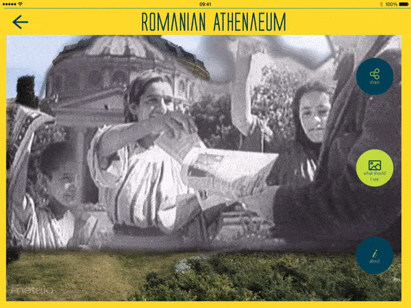
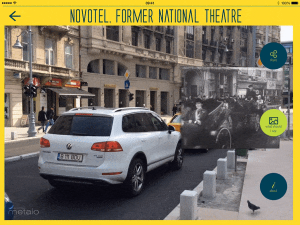
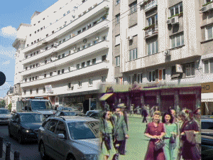
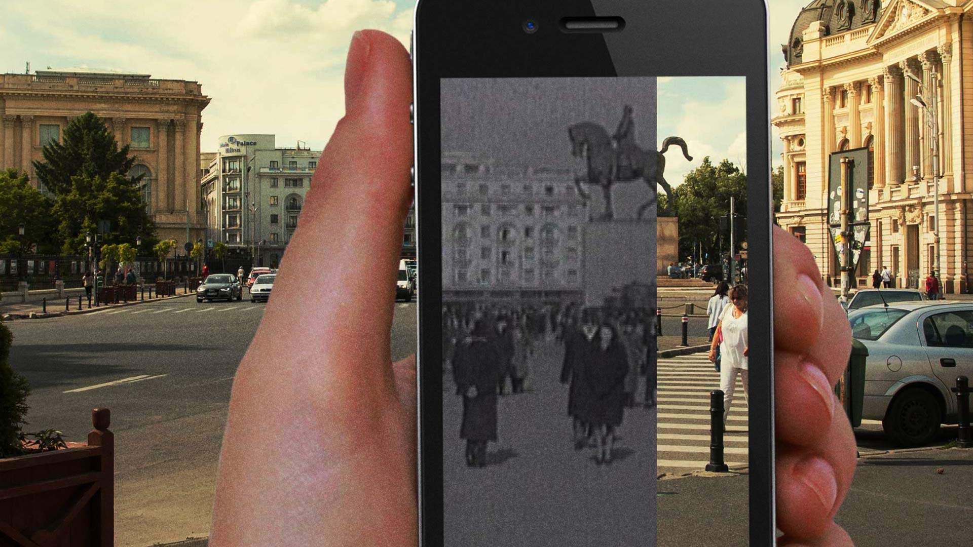
We used stabilization and reverse tracking on videos to blend them with the environment better.

Improvements

A SLAM map is a map of reference points of the environment that helps the phone recognize the space. It allowed us to use any real-world object as a tracking reference and ditch the QR codes and improve the user experience

Setbacks

As they say, every solution brings its problems. By using 3d maps, we had to consider the light conditions. We had to create a map for every hour of the day and sky conditions.
So we tested using a 3d model of the target. Unfortunately, this one didn't work as well.

Bonus

More often than not, a limitation can result in increased creativity.

Psychology

Old footage's black & white effect makes everything seem like a very distant and different time. In the future, we should consider colourizing the footage.

Testing

Fast iterations allowed us to be aware of technical and conceptual limitations and changed how we would tell a story.

User Flow

To improve it, we employed beacons that quickly signal the presence of the point of interest and reduce the steps the user has to go through. After testing, we discovered that using haptic feedback dramatically improves the experience.

UI Design

Old newspapers inspired the colour scheme used for the first iteration. 

UI Design

The colour scheme's increase in saturation made the app look fresh and more friendly.

Marketing

Some ideas for marketing the app.

Honors & Mentions

The project was well-received and awarded.

Trailer